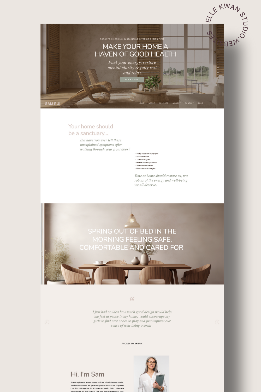
In short: An interior designer website portfolio books clients when each project is told as a story as well as shown as a gallery. Show your best four to six projects, write a specific brief, challenge, approach and outcome for each, put your location in every project title, and finish with a clear next step. Frame your projects with plenty of white space resembling a magazine spread.
Think of each project as a small magazine feature. Your client is reading about a real family, a real problem and a happy ending. Photos prove you have taste. The story proves you can solve their problem, and that is what they are paying for.
Words do a second job too. Google and AI assistants cannot see the mood of a room, but they can read a clear paragraph about who you helped, where, and what changed. A project page with a specific title, a written brief and a named location is far easier for search to understand and recommend. If you want the bigger picture on that, my guide to getting AI to refer your interior design services walks through it.
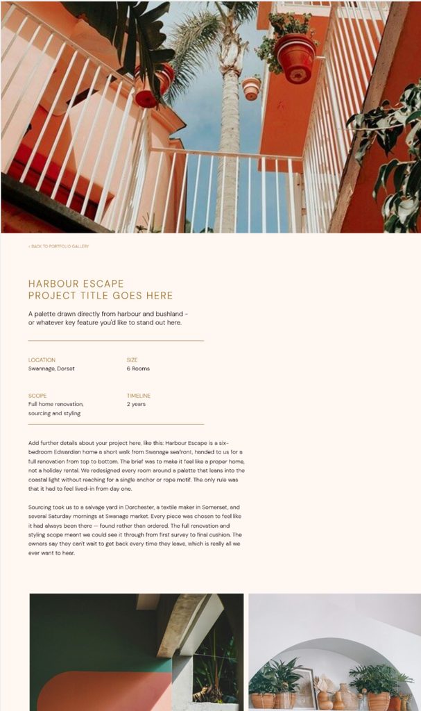
Seven parts of an interior designer website portfolio page that attracts clients
Build every project page in this order, top to bottom:
- Cover image. The single best shot, chosen to make someone stop scrolling.
- The brief. Who the client was, how their home felt before, and what they actually asked for.
- The challenge. The real problem underneath the request, such as a stalled renovation or a period home being slowly spoiled by well-meant choices.
- The approach. Two or three key decisions that shaped the project. Explain the decision, not just the room.
- The outcome. What changed, described as a feeling rather than a finish schedule.
- What delighted your client. The specific detail they still mention.
- The gallery. The wider set of images, in a deliberate order.
Then add the part most portfolios forget: a clear next step. After the gallery, tell the visitor what to do, a short line about how you work and a button to enquire. Put your strongest testimonial near your strongest project, not buried on a separate page.
For the gallery, less is more. Four well-told projects beat forty. Aim for 8 to 12 images per project in a thoughtful order: the establishing shot, a detail, the bit that was the problem, then the wide “after”. If you would not slide a photo across a table in a printed portfolio, leave it off your site.
Write it with this fill-in-the-blank
Stuck on the words? Fill in these five lines and you have a first draft:
- When [Client] came to us, their home ___.
- The brief was ___.
- Along the way, we ___.
- The result: a home that ___.
- [Client]’s favourite part? ___.
How does a weak interior design projects page compare to a strong one?
The difference is specifics. Take an illustrative kitchen project. There’s two ways to tell it. The first is the weaker way:
Weak
Title: Kitchen renovation
We gave our client a stunning, modern kitchen with beautiful finishes and a refreshed feel. The client was thrilled with the result.
And here is a stronger way:
Strong
Title: Light-filled family kitchen, Hove, East Sussex
A family of five had outgrown a kitchen that had not changed since the house was built in 1990. They asked for more storage. What they needed was a room where four people could cook without arguing. We moved the hob to the island, opened the wall to the garden, and built a bench seat for homework. The result: a kitchen that now runs the whole house. Their favourite part? The bench, which has become the family’s morning meeting spot.
Notice what the strong version does. The title begins with story telling. We know there’s a family, a kitchen, and the space is full of light. The brief names a real situation. The outcome delivers a real feeling. These are details that make a reader smile, and gives the right client a situation they could see themselves in.
Bonus points? Always put your location in the project title, for example “Calming coastal refurbishment, Margate, Kent”. It tells search, AI tools and potential clients exactly where you work.
Layout tricks that make a portfolio feel prestigious
The fastest way to look expensive is to stop you website looking like a template for another business.
Websites platforms with templates aren’t living the ins and outs of interior design. And, to be honest, this industry can be hard to navigate from the outside. So they don’t particularly cater to your ideal audience, in the sections they contain, or a high-end feel.
Many website platforms also restrict portfolios with grid sections. Overlapping elements are fiddly (or impossible) to add, and mobile layouts fail to display them well.
Showit is set up more like a blank canvas, so you can place anything anywhere and design desktop and mobile on their own. That makes editorial, magazine-style layouts easy. Imagine a full-bleed cover image with the project title set in large type over it, a tall portrait photo overlapping a wide landscape one, a pull quote from your client floating beside the gallery, and captions tucked into the whitespace like a printed spread.
These are the kinds of displays that luxury consumers are used to when they scroll home design websites and magazines.
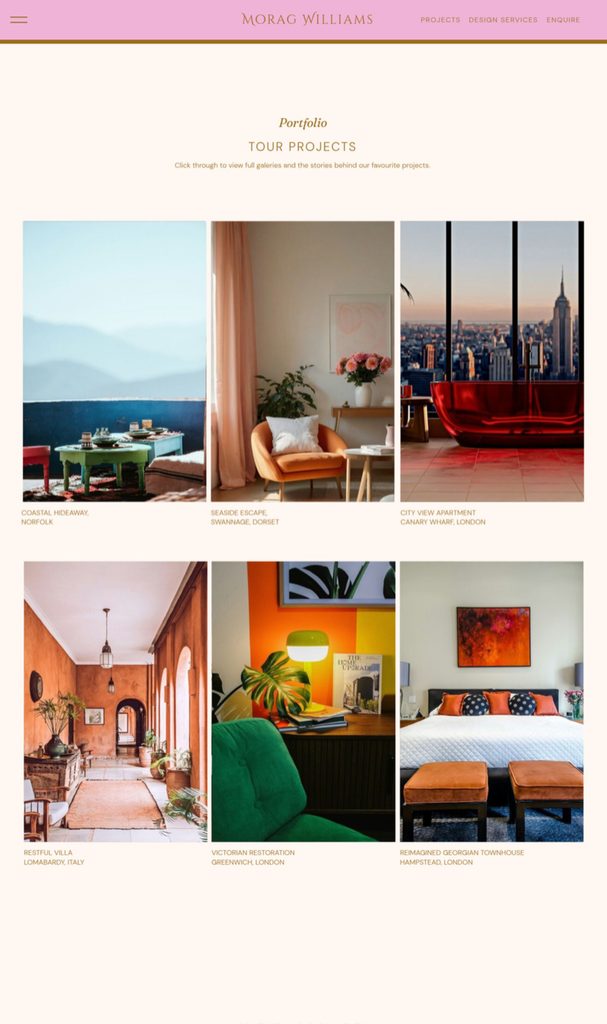
This is not to say all grids equal unappealing layouts. Far from it. Yes, a uniform three-by-three block of equal-sized thumbnails can read as “cookie cutter.” But a grid with plenty of white space as breathing room does read aspirational. I really like a taller rectangular threesome, which look very elegant and classy too.
Other ideas include positioning one large image with a small detail shot, or staggered two-column rows at different heights.
One final tip is to use fewer images at larger scale, and let the whitespace do the talking.
Your homepage is your first interior designer website portfolio
Let’s not forget about the first portfolio your clients will see on your website. Nine times out of ten, the homepage is where they first show up. Most visitors arrive on your homepage and decide in a few seconds whether you are their kind of designer. In fact, 98% of website users say they judge a website on its visuals first.
That means the hero image and the first gallery are doing the job of a portfolio before anyone clicks through to your actual projects page.
This is great news for interior designers, offering a beautiful first look into your design style.
Hero image options that work as a portfolio
Your hero is one or a few scroll-stopping images that exemplifies your design. Some sites use a split screen to show more photos, you can use a scrolling gallery or a video. Both give readers a beautiful first impression and welcome to you and your work.
I think the best come with a line on the picture or immediately underneath it. Use a short line that talks about an outcome, or a simple, accessible line that sums up your aesthetic.
“Homes that feel like the people who live in them” says more than just “Interior design services”.
Choose the image the way you would choose a magazine cover, and consider one of these approaches:
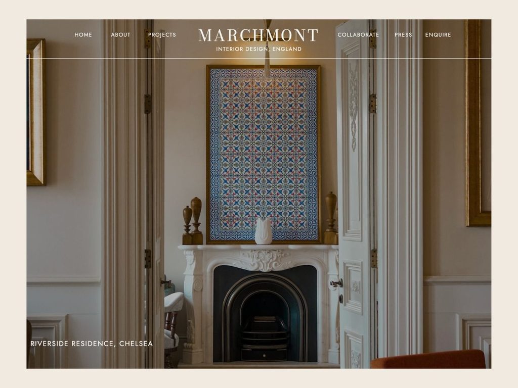
- One full-bleed project photo. The simplest and most luxurious option: your single best shot, edge to edge across the screen, with a short headline set over a calm area of the image. Choose a project you want more of, not simply your newest.
- An asymmetric editorial hero. Place a tall portrait image on one side with the headline on the other, and a small detail shot overlapping the corner.
- A slow crossfade of three images. Show a living space, a detail and a wider room, each held for a few seconds. Keep it to three, make sure the first frame works on its own.
- A short, silent video loop. A slow walk through a finished room can feel wonderfully atmospheric. Use it only if the file is small and the poster image still looks sharp while it loads.
Whichever you pick, make sure the headline you use stays readable on mobile and that the image shows a real project rather than a stock photo.
How the first gallery on your homepage is perceived
The gallery just below your hero is seen as another sample of your taste. Visitors assume it is your best, so whatever sits there sets their expectation for everything else.
Here, less can be more. For instance, three strong projects with a name and one line each, does feel more considered than a dozen thumbnails.
It is helpful to offer a description, especially when it reinforces your niche. For instance, “a Georgian rectory that finally felt like it belonged to its family, rather than it’s history,” is a good way to reinforce the idea that you are a specialist in historical residences.
Place a clear “See all projects” or “Open Gallery” link at the bottom of the spread that invites readers to view your larger portfolio.
Remember, one weaker image in this first gallery can drag down the rest, so be ruthless about what you choose goes here.
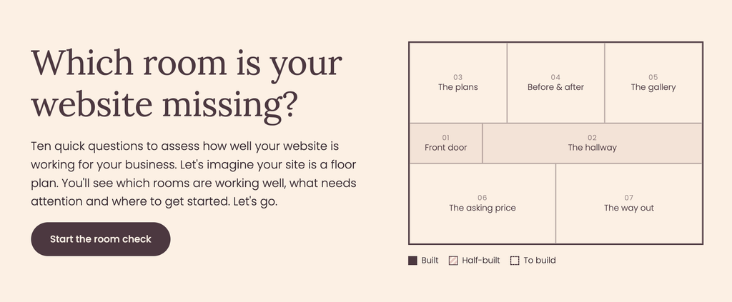
Not sure which pages your website is missing?
Find out if your website has everything it needs to attract your ideal clients. Take the quiz now.
What if you are new or are still building a portfolio you can share?
This is a common question designers ask. Maybe you are early in your career, or maybe you have many years experience working for another company and so your projects are under NDA. Don’t worry! You can still build a portfolio page that earns trust.
Create a Featured section on your homepage and projects page that gives more of a flavour of your work. Mix in whatever you honestly have, whether that’s one or two completed projects, your own home, a styled shoot, or concept work.
Alongside these images, add renderings, moodboards, material palettes and sketches. Clients love the romance of a moodboard and other collateral because it lets them feel the mood of a room and shows how you think.
Write these up in the same way as a finished project, with a brief, the idea behind your choices, and the feeling you were aiming for.
Do label concept work clearly as “Concept” or “Rendering,” so nobody mistakes it for a completed home, and ask permission before sharing anything that belongs to a client.
As real projects come in, just swap them into your featured section one by one.
Next steps: How to get started on your portfolio
A portfolio that books clients is not a bigger gallery, but it is a better story. Choose your best four to six projects, and tell each one’s story, in the order of brief, challenge, approach and outcome. Put your project’s location in every title.
Try to describe the end result as a feeling so that the reader can imagine the same for themselves. Aim to let a considered, editorial layout with generous whitespace signal your level of design expertise. Please do give your visitor’s a clear next step. At this level, something refined, such as “Make an Enquiry,” or “Enquire here.”
With this level of personalisation, you elevate your positioning and stand out from other designers your clients mmight be comparing you against.
With these few design ideas and your portfolio stops being something people just admire and starts being the reason they get in touch.
If you would like the portfolio page built for you, every one of my Showit templates includes a projects page designed around this exact client-attracting story structure.
Interior designer website portfolio FAQs
Show four to six of your best. Choose projects you would happily take again tomorrow, because your portfolio should advertise the work you want more of. Four properly told projects beat forty.
Aim for 8 to 12 images per project, in a deliberate order: an establishing shot, a detail, the problem area, and the wide “after.”Anything you would not put in a printed portfolio can go.
Yes, always ask. Get written permission to share photos and the story, and agree whether you will name the client, or only the suburb or town. A first name and a location are often enough.
200 to 250 words is plenty. Cover the brief, the approach and the result, and write it like a magazine feature rather than a project report. Use specific, sensory details instead of words like “stunning” and “beautiful”.
It can. A specific title with your location, a clear brief and a written outcome give search engines and AI tools real words to understand and recommend. For the wider picture, see SEO for interior designers.
Further reading: Interior design website content: the 10 elements and How to get AI to refer your interior design services.


Elle Kwan is the founder of Elle Kwan Studio, which creates editorial Showit websites and templates for interior designers who want to stand out and win more enquiries. A former lifestyle magazine editor, she is a trained conversion copywriter and SEO specialist happiest designing sites that feel like they were styled for a magazine, and creates instant client trust.
When she’s not designing, you’ll find her drinking tea, devouring magazines, or walking her cheeky chihuahua.
Explore Showit templates and free resources at ellekwan.com.
