
Why should I have a website when my projects are all on social media?
It’s a question I hear often! And it’s a good one.
Here’s my honest answer: a feed is brilliant for feeling seen, but surprisingly bad at bringing in the right enquiries.
A client I worked with recently had poured a lot of time and effort into her Instagram account.
I asked her about the enquiries she got. People who contacted her were either vendors trying to sell something, or DIY-ers wanting to know about the tile she chose for a powder room. They were far from her ideal clients.
Another thing about Instagram is you don’t own the algorithm, and if they flip the rules, your feed goes wonky. Plus a grid or story only ever shows your latest work, whereas a website presents a curated portfolio of your best work.
Then, think about how differently a referral behaves. These are people who are a level up in their desire to hire an interior designer like you. In other words, they are actively interested in who you are and how you can help them.
Which brings me neatly to this idea of what your ideal clients want to see on your website.
Many interior designer websites I review focus on a gallery of projects. This is the perfect starting point. However, most sites miss out on the ideal sections and pages a great interior design website needs to engage and convince a potential client to enquire.
So this guide will walk you through the essentials. Here are 10 pieces of content interior designers should include on their websites. You’ll also find a fill-in-the-blank starter for each section, so you can actually use this post too.
Here’s your interior design website content checklist
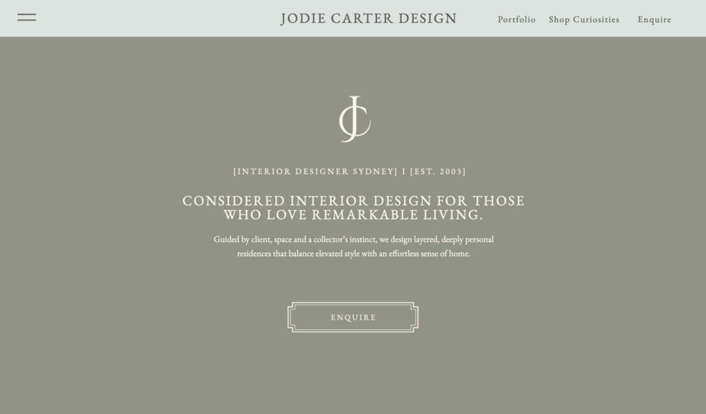
Give your homepage one clear line
A beautiful site that’s all photos with no interior design website content is kind of like attending an open house without a an expert touring you through.
Your opening words are what turn a browser into an enquiry, and they’re what Google, and now AI tools like ChatGPT, actually read to work out who you are and whether to recommend you.
Your homepage has about three seconds to do its job, so it doesn’t need everything, just enough to make someone want to keep scrolling.
The one thing it can’t skip is a line that says what you do, who for, and where, in plain words. “Timeless interiors” tells a stranger nothing. “Full-service interior design for period homes in Edinburgh” tells a visitor everything they need to know in the first five seconds.
Fill in the blank:
[Service] for [who you serve] in [where you work]. Known for [the thing you do better than anyone else].
Full-service interior design for period homes in Edinburgh. Known for making listed properties work for young families.
Keep the rest of the homepage light: three featured projects, a line of proof (a testimonial or a press mention), and one clear way to get in touch.
Your About page is your best intro
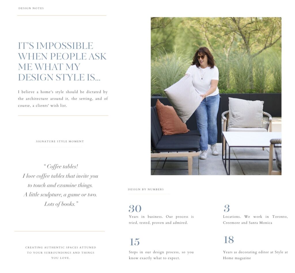
Lots of designers shy away from writing an About page. Some don’t like the idea of standing in the spotlight (who, meee?!). Others think it feels salesy and the projects should sell your services.
But think of it this way. Your client is about to let a stranger into their home for months or more and spend big. This means they aren’t choosing just a service, they’re choosing a person.
Your About page is where they decide whether they’d enjoy being in a room with you.
Here’s a quick test: delete your name from the page. Could a client still tell it was you? If the answer is no, your about page is likely too generic to do what it needs to.
Fill in the blank:
I think [a genuine opinion about design]. Which is why [what you actually do about it].
Here’s an example:
I think most homes are over-lit and under-layered. Which is why the one of the first things I do on any project is turn off the main lights and then work out which spaces could use more or less light according to where you sit.
Your opinion doesn’t have to be about lighting. It could be about storage, materials, how a family actually lives in a room, or anything else you feel strongly about. The topic matters less than having one.
Another example: I think open-plan living isn’t right for every family. Which is why I always ask how you actually want to feel in a space before I work on a floorplan.
An opinion is the fastest trust-builder you have, because it’s the one thing nobody can copy. If you have a headshot onsite or on a project, add that here too.
Add the “before”story to your portfolio projects
Scroll ten designers’ portfolios and they’re all beautiful, bright and styled. Nobody can tell what you the challenges and obstacles it took to get there!
So include how you worked on your projects alongside what you delivered. This is how a visitor recognises themselves. If they’ve got a dark north-facing kitchen the family avoids, for instance, and the moment they see you fixed that in a project, they stop scrolling and start considering you.
It’s clear you have what they need.
Fill in the blank:
The problem: [what wasn’t working, specifically]. What we did: [two or three key decisions]. The result: [how the space is used now].
The problem: a north-facing kitchen the family avoided from October onwards. What we did: moved the range to the internal wall and warmed the palette up by three shades. The result: The kitchen is where this family eats every meal now, year round.
Your process page should answer the questions in your clients’ heads.
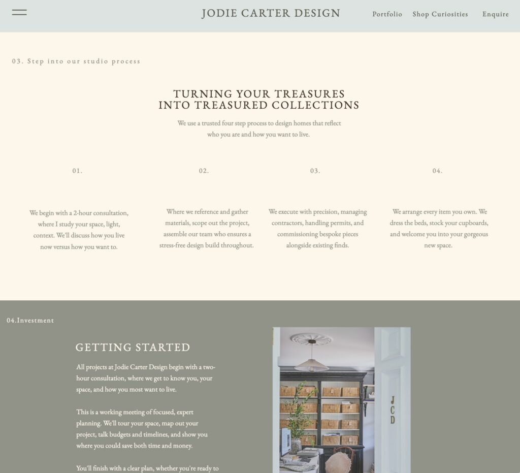
Almost nobody includes this page, but it’s the one clients love to see. This is the page that answers all their most vital questions, and gives them a great idea of what to expect.
This builds trust on their end, and means they contact you with a clearer picture of what you can achieve for them.
How much will this cost before I’ve committed to anything?
What’s included in a project?
How long will people be in my home?
What if I hate the concept?
A simple 1-2-3 works. Outline three steps that give a shape to a whole project.
Call, curate, create, for example. Or: meet, plan, present. Pick three verbs that actually describe how you work, and write one short line under each.
Fill in the blank:
(Call) When you get in touch, here’s what happens. Within [number] working days I’ll reply with a few questions about your home. If it feels like a fit, we’ll book a [length]-minute call, no charge, no obligation. After that, I’ll send a written proposal with scope, stages and cost, so nothing’s committed until you say yes.
One other thing.
Add a starting figure too, even if it’s a rough one. “Projects start from £X in design fees” does three things at once: it filters out people who were never going to proceed, it signals you’re confident in what you charge, and it lets a serious client step forward without negotiating blind.
Your contact page needs to actually work
Here’s a fun little challenge for you, and it takes two minutes. Open your site on your phone right now, fill in your own contact form like a stranger would, and hit send. Then go check it actually arrived, spam folder included. Broken and misrouted enquiry forms are far more common than anyone likes to admit, and every one of them is a project lost without you ever knowing it.
No contact form? Get one!
Fill in the blank:
Ready to talk? Tell me a little about your home and what iyou have in mind. I reply to every enquiry within [number] working days. Prefer email? Reach me directly at [address].
It isn’t overkill to add a box like that to every key page on your website. People may love your work and be keen to take action, so this is your invite to them.
Your FAQ page is your best shot at AI search
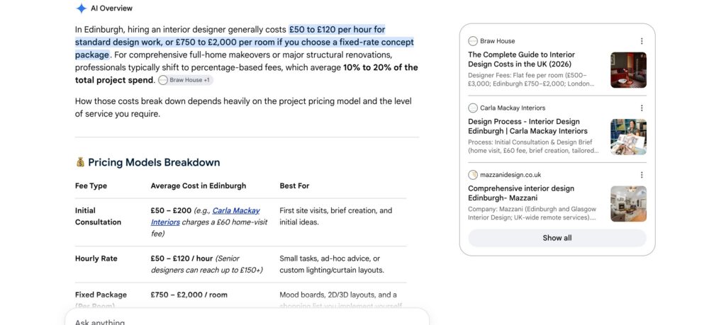
FAQs used to be a courtesy. Then they kind of disappeared. Now they’re back, and they’re doing double duty. This is because an AI loves them. When they are trying to field an answer to someone searching for “best interior designer for a period property in Edinburgh” it doesn’t read your whole site the way a person would.
Instead, it hunts for short, clearly labelled question-and-answer pairs it can lift cleanly and attribute to you.
So, in 2026, including a FAQs page or sections makes it easy for AI to quote your site in its results.
The trick is writing the question the way a real person would actually type it.
To get started, just think about the questions your clients tend to ask you. Aim for six to ten questions covering price, timeline, geography and the projects you work on.
Your testimonials need to say more than “lovely to work with”
Ahhh, testimonials. Don’t groan. I know they often come last on the to-do list, or sit buried in a file nobody ever opens. The reason is usually that they don’t sound all that convincing. Most are filled with vague sentiments like, “Ali is an absolute joy to work with.”
The problem that a stranger who reads that line has no way to picture what you actually did, or why that matters.
Fill in the blank:
When you ask for a testimonial, use these three questions. They draw a more complete picture.
- What design problem did you want to solve?
- What did the process actually feel like?
- What’s different now?
Make sure your website (and work) linger longer
Truth be told, most of your website visitors won’t hire you on their first visit. Some might simply need to share the site with a partner, others might be months away. They’re still collecting ideas, or still deciding when the right time for their project is.
But, if you give them something worth remembering, and, of course, a way to stay in touch, you’ll linger longer in the background while they choose.
Try a simple email signup, with an offer to send something genuinely helpful. It could be an interior design planning checklist, a services or pricing guide, or a short list of questions to ask before a renovation.
How do you turn that interest into actual booked consultations? My free training shows you how to take a pricing guide or portfolio to invite, connect and convert future clients. You can find it here Sell your interior design services on autopilot (free email templates included!)
Fill in the blank:
Not ready to get in touch yet? Grab my free [name of guide] and get useful tips on [the thing it covers] straight to your inbox.
Put the signup somewhere it’ll actually be seen: your homepage, the foot of your blog posts, and your footer.
Make space for your status symbols
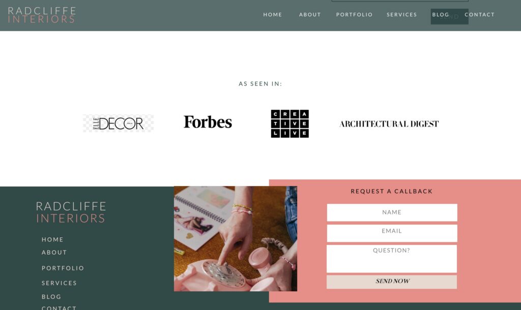
A testimonial is proof someone else believes in you. Press mentions, brands you’ve worked with, and professional memberships do something slightly different: they instantly impress. A short “as seen in” strip, or a line of logos on your homepage does shows you work to a high level.
Fill in the blank:
As seen in [publication], [publication]. Member of [association]. Trusted by [brand or partner].
If you don’t have press or partnerships yet, a qualification or a membership still counts. In my view, even one line of proof beats none!
Don’t forget your legal pages
Nobody enjoys writing these, which is exactly why they’re often the last page built, if they get built at all. But they’re not just filler, they’re the law in most places. If your site has a contact form, an email signup, or analytics running in the background (and most do), you’re collecting personal data, and privacy laws like UK and EU GDPR, and equivalents elsewhere, require you to say what you collect and why.
A terms page does a different job: it sets out who owns your photos and words, and protects you if a dispute ever comes up.
Fill in the blank:
You don’t need to write these from scratch. A generator like Termly or Termageddon will get you a solid starting template covering data collection, cookies and liability, which you can then personalise to your business and get properly checked over.
Your round-up: Essential Interior Design Website Content Musts
Here’s your interior design website content checklist, at a glance.
| Page | What to include |
| Homepage | One line: service, who for, where, known for |
| About | Your interior design origin story, design point of view and opinions |
| Portfolio | Remember to include a write-up about the problems you met and overcame on the project, milestones and high points |
| Process | Your 1-2-3 steps on how your design process works |
| Contact | Make sure you invite a client to reach out easily, preferably using a form or email |
| FAQs | Use these to answer the real questions clients ask you, and improve your chances of showing up in AI too. Win-win |
| Testimonials | Use the 3-question framework to make your testimonials scroll-stoppers |
| Email signup | Offer a helpful reason to sign up and say in touch |
| Proof | Make space to show off your accreditations and press mentions and build trust with your reader |
| Legal pages | Include privacy and T&Cs and stay on the right side of the law! |
If you’ve been pouring your time into Instagram and it isn’t bringing in the enquiries, or the kind of clients, you’re actually looking for, or your website just isn’t pulling its weight, this is usually why.
All the FAQs about Interior Design Website Content Planning
At minimum: a homepage with a clear one-line hero, an About page written in the first person, a portfolio that shows the problem as well as the result, a process page with a starting price, a contact page, an FAQ, testimonials, and a way to collect emails from people who aren’t ready to hire you yet.
Shorter than you think, except on your portfolio and About page. A homepage needs only a few strong lines. Project pages and your story can run longer, since that’s where the detail actually earns its place.
A blog helps you get found in Google and AI search, since it gives you more pages to detail what you do, and can also be a powerful way to show off your design expertise. I think a blog can be the perfect place to publish your before and after project details, document your design process when you are working on a project, and even weigh in on the industry. Blogging is just one type of marketing though. If you prefer Instagram, have a good Pinterest strategy or have a steady referral routine, it’s fine to stick with those. If writing your thoughts about design, and sharing how what you are working on appeals, then go for it!
Ask your client three questions: what problem they wanted solved, what the process felt like, and what’s different now. Their answers give you something specific and sensory, which sells far better than a generic compliment.
Not always. If you’ve designed some rooms or spaces you are proud of you can still use those in a gallery that shows off your design style and point of view. Other clients of mine have lots of experience working with interiors firms but their project photos are behind an NDA. In both these cases you could put up a one-page website, and build it out, with a full portfolio, as you get more projects. If you have no real work to show, consider designing out a space in your home, or a friend’s home first, and then add these to a “recent projects” gallery when you have some good photos.
Ready to write it?
If you’re planning your website now and want help mapping out your interior design website content before you start, grab the free planning checklist from my pre-design guide. Interior Design Website Ideas: Your Pre-Design Checklist
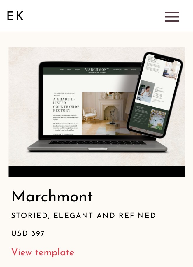
And if you’d rather start from a template that already has these pages built in my Showit templates for interior designers are ready when you are. Shop the templates now

Elle Kwan is the founder of Elle Kwan Studio, which creates editorial Showit websites and templates for interior designers who want to stand out and win more enquiries. A former lifestyle magazine editor, she is a trained conversion copywriter and SEO specialist happiest designing sites that feel like they were styled for a magazine, and creates instant client trust.
When she’s not designing, you’ll find her drinking tea, devouring magazines, or walking her cheeky chihuahua.
Explore Showit templates and free resources at ellekwan.com.


