Why do some websites bring in inquiries, leads, consults and projects, while others get almost no attention?
It almost always starts with the homepage. This is the first – sometimes only – page potential clients see. The homepage is an essential step your clients take in getting to know you, validate you and choose you.
This is the spot they hang out after devouring your instagram feed, or the page they click when a past client has recommended you.
So if your homepage isn’t built to immediately grab their attention and keep them reading, they go back to Google and back to searching for a designer instead of choosing you.
Lost opportunities? Definitely.
Most designers think a lack of good project photos, or the way projects are laid out on the website are what stops potential clients reaching out They worry about not showing impressive enough projects, or they actually include too many, which gets confusing.
I do see that. But I also see gorgeous sites with impressive portfolios getting ghosted.
That’s because potential clients are seeking more than a portfolio anyway. A few select images can work wonders on a homepage that also does other things and projects you well.
A polished brand vibe with a homepage structured to hold their interest and answer their questions prompts them to act – to call you or book a consult.
Convert Clicks to Consults In One-Page
In this post, you’ll discover the 8-sections a good homepage design needs to convert clients – with a free template you can use and publish in just a few hours (I promise!).
I’ll show you messaging that moves your client and prompts them to act, a layout structure that guides them to a decision, and trust factors they need to see to confirm you expertise. And yes, we’ll talk about your portfolio.
If you’re just started out in your interior design journey, or you just can’t bare to share your current site the way it is now, this could you be your perfect solution. Whether you use the template or re-work your own website.
Because, when you get the homepage right, you can:
- Increase leads and consults
- Attract interest even if you have a smaller portfolio
- Put a professional stamp on your business
- Show your best clients why they should choose you
- Attract better-fit clients and projects you love
- Rely on your site to bring in more business for you
You don’t need to spend six months hunting down a website designer or put together a whole website. Get your homepage in order first and figure out a full website later.
What makes an interior designer’s homepage convert?
But just quickly, a mindset check: your homepage’s job isn’t to force a sale. It’s to build trust quickly and move the right visitor to the next step in your process.
Why? The truth is, most of us don’t buy high-consideration services straight off a homepage — instead they prompt website visitors to make a next step. This can be a call, or an email, or whatever you decide you want them to do.
Well-planned websites use messaging and layout to make that next step a no-brainer. Read on to see how.
Good interior designer websites confirm these things
Most website visitors – or what marketing experts call “referral traffic” are performing a quick online chemistry test.
They want to know:
- Are you legit?
- Is your style a good fit?
- Can you do the job they need you for?
- If yes, how do they get in touch?
Your homepage acts like the lobby of your studio — it has to welcome a variety of different guests:
- Someone who just saw your name in their Google search results this morning
- A warm referral that heard about you through a past client
- Potential partners, from home builders to furniture specialists.
Everyone arrives with different questions. A good homepage meets each visitor where they are and guides them to a next step, moving them along a gentle path from “just browsing” to “book a consult.”
8 best sections for a interior designer’s website homepage design
Let’s jump into the 8 essential sections you should include on a homepage that converts.
These 8 sections are what I call the essentials for giving a perfect snapshot into what you do and how to book you. Used together, they answer all the concerns in a site visitors “chemistry test.”
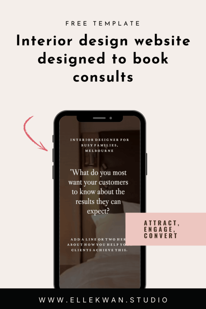
Section 1: Opening headline
Welcome to the most valuable real estate online. Done well, this section immediately confirms who you are, what you do and how you do it. Short works best, and you don’t need to sound too polished. If you feel yourself tense up, imagine explaining what you do and who you help to your best friend. Here’s a good framework – just switch it out to suit your firm:
Example: Elevated residential interiors for busy families
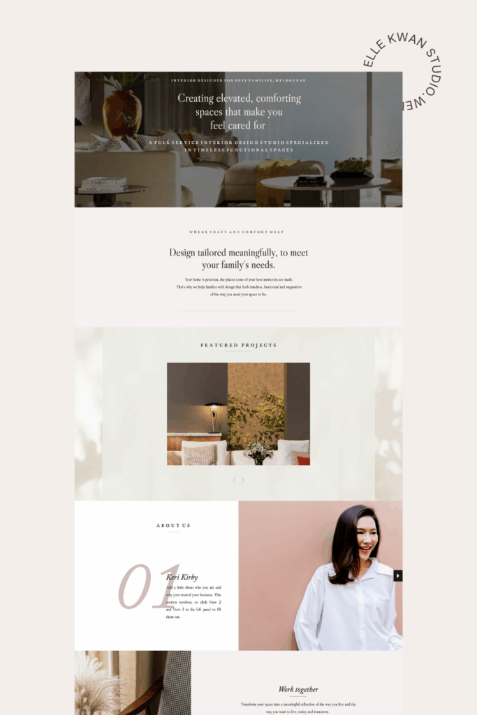
Section 2: The result your customer wants
In section 2, talk about the difficulties you see your clients struggle with. I call this their “yuck” situation. Talk about the kind of problems you solve for clients – the problems they have right now – and why you hate to see them struggle.
When you get specific with this, you really carve your niche and stand out against every other interior designer – Plus you speak to your ideal customer, which prompts better-fit inquiries.
Example: Renovations and full‑service furnishing can feel overwhelming. That first weekend sourcing furniture? Fun. The 6th week shopping in a row with kids in tow? Not so much.
We manage the details from concept to install so your home feels beautifully finished.
In this example, we know we’re talking to families who might be considering doing the project themselves. Who is your ideal client and what decisions do they struggle with? Think about how you can write to them and address their situations.
Section 3: Your why-work-with-me statement
This is a promise you love sharing with clients. It’s a one-line statement about what your client would love to experience after working with you. Really, it’s the big, bold “yay” solution that follows the “yuck” situation you empathised with your clients about in section 2.
Design wise, this breakout statement uses a larger fond to capture attention, and works really well to stop the scroll. If you’re stuck on what to write, try this:
Example: If you want a [add type of project] that feels [results when that project is done], you’re in just the right place.
Like this:
If you want a beautiful, durable home that feels calm and functions effortlessly, you’re in just the right place.
Section 4: Project spotlight
See what we did there? Adding your portfolio down here in Section 4 invites a visitor to scroll through your site to reach it. In the free template, I added a simple scrolling gallery which serves to highlight your key projects. (This is ideal if you don’t currently have a large number of projects to show).
Section 5: Mini bio
A mini “about me” puts a face to your design studio and adds a human touch that clients connect with. Think of it like an elevator-style pitch you’d use to introduce yourself at an open house, only here, online.
Include why you chose interior design, or how it found you. Answer what you most love about your work. You might like to detail who you work with, your process, your specialty or what you help your clients achieve. Don’t forget a warm and welcoming invite to work together.
Example: I’m Astrid, an interior designer with a soft spot for calm, livable luxury. I fell in love with design while transforming my own too-busy home into a sanctuary — and never looked back.
I love turning daily routines into effortless moments — installing light, flow, storage, and lots of soul. The magic for me is marrying craftsmanship with comfort so your home feels as good as it looks. I’d love to help you too.
Section 6: Services
Include services on your homepage to help visitors self-select what they want to hire you for. A simple trio of offers, like Full-service, Renovation/Build, and Furnishing & Styling actually moves clients in their decision process as they consider the options, and reduces inquiries outside of your scope and niche.
Section 7: Testimonials
What better way to show you are skilled and reliable than for your past clients to let everyone know! Even one testimonial helps to build trust, and you can add more as you grow. Again, these should be big enough to catch attention as a client scrolls.
Section 8: Keep in Touch
The key to booking calls through your website is to make the next step obvious and easy. It’s so easy to forget to even make an invite – and just tuck your email or phone number in a hard to find spot.
Use a button that says “book a consultation” and link it to a booking app like Tidycal that lets clients schedule their call. Or try sharing a useful resource. Offer to email them your price list or a portfolio of work. That way, you start building a list of potential clients you can keep in touch with – and even call on when you need to fill your pipeline. I have a free training on creating a simple client-building list with just 3 emails –> Access the Free Training here.
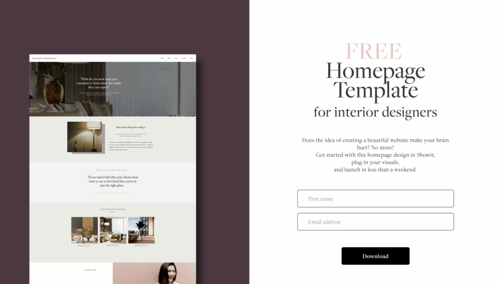
The free homepage template for interior design websites
Each section in this homepage design template is included because it helps to keep readers scrolling your page, and gives them all the information they need to build trust in you and your design work. Download the template and you’ll see each section has easy-to-fill prompts that take less than an afternoon to fill in.
Curious about how this looks? View the template here
Why this free template converts
In just 8 sections it prioritises what referrals want to see first: portfolio, services fit, and the next step they can take to work with you. It builds trust before asking for commitment and that clear path to book a consult means it’s easy for clients to decide to jump in.
How to launch this one‑pager this week
Honestly, if you have a day you could totally launch this new one-page website in a day. But let’s say you have only have two hours a day. Follow this implementation guide and and you’ll be done by the weekend.
- Day 1: Fill the template prompts for sections 1–6. Choose your colour palette & fonts.
- Day 2: Curate 6–8 images that show your work and add them to the gallery section.
- Day 3: Add a testimonial. Add your ‘book with me” button to Tidycal or similar.
- Day 4: Proofread. Ask one trusted peer for a 10‑minute review.
- Day 5: Publish and start sharing your new polished site.
More template questions answered
Q: Is this interior website template free?
A: Yes—this is a free one‑page homepage outline you can implement today on the Showit platform. Get a month free with Showit here. I’ll share the template with you via email. Fill in the blanks, link to your domain and hit publish.
Q: Which platform is best for this one‑pager?
A: This template is build to work on Showit. I love Showit for interior designers, because it’s aesthetically beautiful and you need no code knowledge to use it. All you do is drag and drop – just like Canva.
Q: Will a one‑pager be enough if I want higher‑calibre projects?
A: Yes. Plus, a clear one‑pager beats an unfinished or out of date site. As leads warm up, you can expand into case studies and detailed service pages without redoing your foundation. This template is designed to grow with you, and you can add in extra pages and sections easily if you want to. I also offer template customisation too, if you want help adding pages later.
Q: Do you offer templates with more than one page?
A: Join the Founders Waitlist for my Interior Designer Showit templates – they’re coming soon and will be designed with the exact framework I use with my custom website clients.
Q: Can you rebrand my whole website for me? Yes! I love working on select custom website services for interior designers. Reach out if you’d like me to design you a gorgeous new website – I’d love to hearr from you, or see my services here.
Download your free interior design template now
So happy you are grabbing this to give your interior design business a professional polish. Click here to get your template.