Your luxury interior design website is the front door to your whole brand
Picture how a future client first meets you. A friend mentions your name over dinner. They spot your kitchen in a magazine, or hears you introduce yourself at a party and types your name into a search bar the next morning. However it begins, it ends in the same place: your website.
That is why your website is not simply another channel. It is the hub of your studio’s whole brand experience, where your projects, your press, your Instagram, your voice and your way of working all arrive at once. When it is done well, everything flows from the first image to the last button like a single design story, and a visitor feels within seconds that they are in good hands.
It also has a wide audience to win over. Some visitors already know your work through friends. Some only heard you introduce yourself at a party. Others have a project and need a designer soon, and others have just bought land and are still dreaming about the build. Your site has to wow every one of them from the very first click.
Two branding exercises to try first
Before you change a single font, it helps to get clear on who the website is for and what you offer your ideal clients. Read them now, but come back to them for a quiet half hour with a cup of tea and a notebook. These are exercises expert branding agencies ask you to consider when you want your studio to make a real visual and emotional impact. It’s this impact that wins client projects.
1. Picture your ideal client. Where do they work? How do they spend their weekends? Which publications sit on their coffee table? Run through your past clients and mentally fill in their weekdays and weekends. Then ask who you most loved working with and why?
2. Describe how you meet there needs. Write down your signature looks, the way you work with colour, fabrics and materials, and the scale and type of projects you love most. Then hold your two lists side by side. Where is the overlap, or the dream meeting point between you and your client?
Ultimately, you are thinking over the problem your ideal client has, and the ways you solve it. When you can demonstrate through your projects and articulate how you help these clients specifically, it feels like a real match. The conversation shifts from “Are you the designer for me?” to “This is the designer for me. What does it take to hire them?”
For instance, one of my clients knew her favourite projects were with people drawn to academia, travel, anthropology and collecting: They were curious, well-read, surrounded by objects with a story. But their problem was these treasured collections were hidden in boxes or crowded shelves, far from being seen, less admired.
The designer above loved curating collections and designing modern, upbeat spaces to hold them. They were the clients she wanted more of. They were who we focused on having her website speak to.
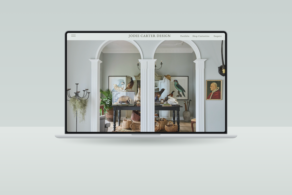
Your website is where the match happens
Your website is where that shift happens too, because it is the one place that can show your work, say what you stand for and guide them to the next step in a single, unhurried visit.
Sotheby’s Institute’s guide to luxury marketing has a lovely lens for this. It describes the 4 E’s, a framework from luxury marketing expert Michel Chevalier: Emotion, Exclusivity, Experience and Extension.
It also reminds us that luxury brands manage every touchpoint with great care, including their online presence (Sotheby’s Institute, Luxury Marketing: A Deep Dive into High-End Branding). You can too.
Here are five places where a website tends to fall short of these elements, and how to restyle your site to suit.
1. Your website looks nothing like the work you do
A lack of online prestige is the biggest mistake I see on interior design websites. Maybe it’s your first website, you DIY’d it, or got it done years ago, and now the Internet has changed. Now websites are capable of transmitting a real aura of prestige and personality, but your website hasn’t kept up.
This can be really damaging when you are building your reputation. You’ll work for months or years on a project, book an expensive photographer and might spend hours perfecting your posts for instagram but as soon as someone is interested enough to click your website, there’s a mismatch.
Your luxurious, deeply-thought interiors lay hidden in a disappointing layout. Colours take away from your designs, or your fonts distract from your projects.
What you want is an online experience that matches the vibe and ethos of your design work.
You can see here how the designer’s fresh, colour-friendly philosophy is seen in her projects, and on her website. It says so much about her work, without the website’s words needing to say much at all.
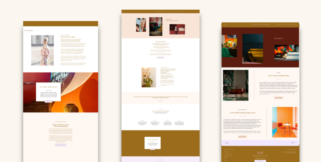
Try this: Compare your best project to your homepage. Does your website share the same colours, space and mood? If not, start with typography, spacing and the hero image you are most proud of.
2. Buried credentials
The other big mistake I see is the opposite of issue 1. In a bid to be exclusive, the designer shows only work. They may have magazine features, awards, podcast appearance, years of experience and a signature system, and all of it is sitting on the About, Media or Portfolio page where few people ever scroll.
No-one searches for prestige, it always makes an immediate impact. Don’t make a client dig for it – use your website to really work as a first get to know you.
Try this: Bring two or three proof points to the top of your homepage, such as “As featured in”, a number of years in the business or projects completed, or a signature approach. This strategy borrows from the brand image and credibility point in Sotheby’s Institute’s luxury marketing guide.
3. Your portfolio shows gorgeous spaces but tells no story
Beautiful photography is a starting point, rather than the finish line. A gallery with no context leaves visitors to imagine what it would be like to hire you. Luxury clients are still people with feelings, and they buy emotion and trust long before they buy a finished sofa.
I always try to make these project stories look like magazine editorial – using layout, language and story to draw the reader in. They are here to decide on a designer. Stories like this help them picture themselves working with you, and in sales psychology, brings them steps closer to a decision.
I include prompts for this in my website templates.
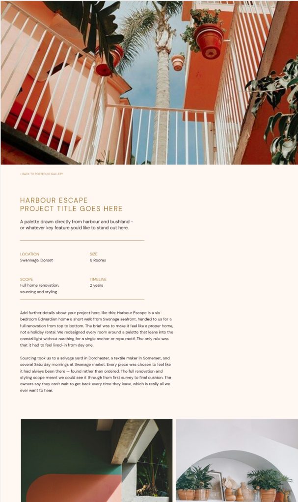
Try this: Choose a few projects and add a short story to each: the brief, the challenge, what changed. Four well-told projects beat forty without context. For more on this, see How to Build a Portfolio Page That Actually Books Clients
4. Your website feels dated next to your competitors
“Dated” is usually a handful of small things that suddenly all add up to one feeling. This website is not up to speed with your business. Old fonts, heavy sliders, text that doesn’t not fit on a phone, maybe even a copyright year from three years ago. Premium clients compare more than they let on, and a site that feels behind makes the whole business feel behind.
Try this: Open your site on your phone and then open two competitors you admire. Note three things they do that you do not. Change them!
5. No sense of experience
Think about walking into a Louis Vuitton boutique, or sitting down at a beautiful restaurant you waited weeks to book. Before anyone says a word, you know what kind of experience this will be. The door is opened for you, the lighting is soft, someone greets you warmly, and you are shown exactly where to go next. Nothing is left to chance, and you feel looked after before you have spent a penny.
People who hire interior designers are used to that standard. They meet it in the hotels they stay in, the shops they browse and the restaurants they book, so they hold your website up against the same level of care, whether they realise it or not.
That is your opportunity. Your website is your front door, and from the very first look you can give them a taste of what working with you will feel like: a warm welcome, a sense of calm and a clear path ahead.
Try this: Explain what working together looks like, in three or four steps, and replace “Get in touch” with a more elevated invitation, such as “Make an appointment”, “Apply to work with us” or “Enquire”. Lead to a short, thoughtful enquiry form rather than an open booking calendar, which can feel casual and cheap.
When you work with me on a custom website project, i’ll ask you to fill in an application so I have a good idea of what you are seeking and whether i’m the right person to help. You’ll hear back from me in a day or two, and then we’ll arrange a time to speak one-to-one.
Having this information ahead of a call means we make better use of your time, and I can come with ideas best-suited to your goals.
Is your website accidentally putting off enquiries?
A short quiz that shows which spaces your site is missing. In a couple of minutes you will see where your website already feels as premium as your projects, and where it falls short, so you know which of the five signs to tackle first. Take the Room Check quiz.
Give every enquiry the welcome it deserves
In real life, you welcome clients, ask about their home, their plans, (their pets), and make them feel that their project mattered from your first hello. Your website should make them feel exactly like that online.
You have spent years building a reputation through every project, referral and feature, and all that work deserves a website that treats every enquiry with the same care.
Ready for a website that welcomes the right clients as warmly as you do? Work with me on a custom Showit redesign and your site will look, sound and feel like your best projects, so the right clients arrive already sure you are the designer for them. Share a few details in a short application, and I will reply within a day or two to arrange a one-to-one conversation. Apply for your custom website design.

Most designers build their website once and then pour their energy into client projects and social media. The work moves on and the website stays still, so the gap grows. It is a very common and very fixable problem.
Yes. People who are recommended to you, or who see you in a magazine or on Instagram, usually check your website before they get in touch. It is often the first real impression you make on someone who has never met you.
Start with the signs of prestige: show your credentials early, tell the story behind your projects, use consistent spacing, type and imagery, and make the next step clear. Luxury is about confidence and clarity, not extra decoration.
Not always. Some of these five fixes, such as moving your credentials up or rewriting your button text, can be done in an afternoon. A redesign makes sense when the overall look or structure no longer fits your business.
It can introduce you, but it rarely closes a sale on its own. Plus, algorithms change, whereas your website is the one place you own and control. If you lost your instagram tomorrow, would you have somewhere to refer enquiries?

Elle Kwan is the founder of Elle Kwan Studio, which creates editorial Showit websites and templates for interior designers who want to stand out and win more enquiries. A former lifestyle magazine editor, she is a trained conversion copywriter and SEO specialist happiest designing sites that feel like they were styled for a magazine, and creates instant client trust.
When she’s not designing, you’ll find her drinking tea, devouring magazines, or walking her cheeky chihuahua.
Explore Showit templates and free resources at ellekwan.com.
